Fibonacci Trader
Maximum Favorable Excursion
Maximum Adverse Excursion
The example stated are for illustrative purpose only, and should not be viewed as advice or guarantee of performance.
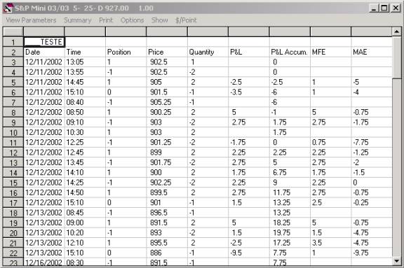
On the System Results window you have the columns trade profit/loss (P&L), the accumulated profit/loss (P&L Accum.), then Maximum Favorable Excursion (MFE) and the MAE Maximum Adverse Excursion (MAE).
Maximum Favorable Excursion is what was the maximum profit that the trade had before the trade closed, on line number 5 you see a trade that lost 2.5 points (P&L) but during the time the trade was open it was one time making 1 point profit, that was the Maximum Favorable Excursion for that trade.
Maximum Adverse Excursion is what was the maximum loss that the trade had before the trade closed, on line number 5 you see a trade that lost 2.5 points (P&L) but during the time the trade was open it was one time losing 5 points, that was the Maximum Adverse Excursion for that trade.
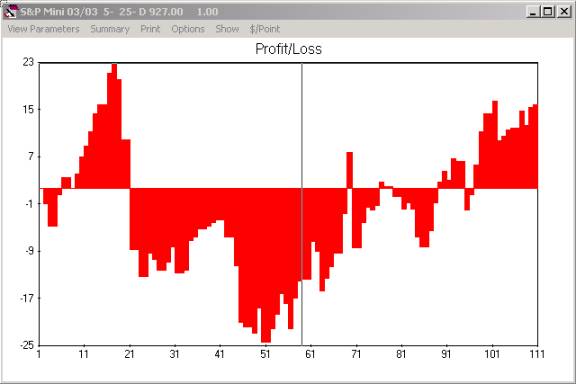
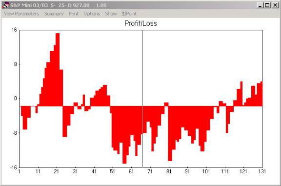
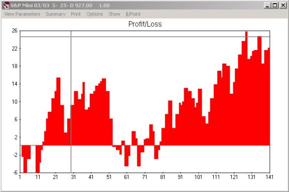
Click on Show, P/L chart and the P&L Accumulated chart will show.
Y axis is the accumulated profit/loss the x axis is the number of the trade.
If you click Show and then on MFE chart, that will show the MFE chart.
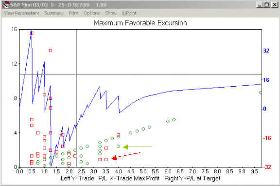
The MFE chart shows in red squares all trades that closed with a loss and in the green square all trades that closed with a profit, the left Y-axis has the total profit or loss of each trade. The X-axis shows the maximum profit that each trade had before it was closed.
If you look the trade that has the red arrow, that trade lost about 1 point but was at one time actually making about 3.5 points profit (MFE). Look at the trade that has the green arrow, that trade made about 3 points profit, but was at one time making 4 points profit (MFE).
The blue line along with the Right Y-axis show how much profit/loss that system will make if you have a profit protection at that X-axis value.
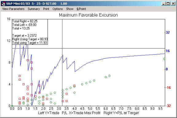
Using the cross hair and clicking on the chart we will find that about 3.25 points target is a good point to add a target to our system. That is 13 ticks on the mini S&P. We will use this information later. Note that using the 13 ticks target all trades to the right of vertical cross hair line will now have a profit hit of 13 points. Note that even using 13 ticks as target may be you still will have trades with more than 13 ticks of profit, in case the target be trigger by a gap bar.
Note the box on the top left corner shows the total profit if the target is not used and the total profit if you use the target at that point.
If you click on Show and then on MAE chart you will see the MAE chart.
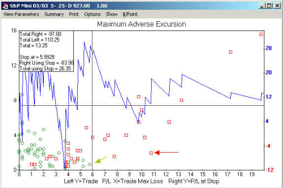
The MAE chart shows in red squares all trades that closed with a loss and in the green square all trades that closed with a profit, the left Y-axis has the total profit or loss of each trade. The X-axis shows the maximum loss that the trade had before it was closed.
If you look the trade that has the red arrow, that trade lost about 2 points but was at one time actually losing about 11 points (MAE) profit. Look at the trade that has the green arrow, that trade made about 1 point profit but was at one time losing about 6 points (MAE).
The blue line along with the Right Y-axis show how much profit/loss that system will make if you have a stop at that X-axis value.
About 6 points is a good value, this is the mini S&P each tick is 0.25 then we can use the 6 or 5.5 or 5 points, if you use the 6 that is a total of 24 ticks stop. Note that using the 24 ticks stop all trades to the right of vertical cross hair line will now have a stop hit of 24 points. Note that even using 24 ticks as stop may be you still will have trades with more than 24 ticks of loss, in case the stop be trigger by a gap bar.
Now we can go to our system and change it to use now a 13 ticks profit, after that our new P&L Accumulated chart will look like the next picture.
Now if we go back to our system and add the stop at 24 ticks the new P&L Accumulated chart will look like the next picture.
The MFE and the MAE are a very good tool to find a good point for your system stop and target.
Since 1992